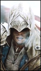
XIII. Posté(e) 17 juillet 2010 Share Posté(e) 17 juillet 2010 Ayant un kit du deuxième volet de la série A.C je souhaiterais si possible un kit du prochain volet qui paraitra en novembre avec cette image : http://image.jeuxvideo.com/images/x3/a/s/assassin-s-creed-brotherhood-xbox-360-012.jpg J'aimerais si possible que, pour l'avatar est la sign', on ne garde que Ezio ( le personnage en blanc ) et que l'on oublie les autres personnages derrière lui . Pour ce qui est des teintes je souhaiterais que l'on reste dans les teintes de l'image. Apercevoir les piliers en fond serait pas mal je pense ( j'ai bien dit : " je pense " =P ) . Pour la typo j'aimerais quelque chose qui soit en rapport avec l'époque ( XVI siècle ). Merci d'avance à tous ceux qui me proposeront un kit _____________________________ -EDIT- Pour ceux qui préfèrent voici une seconde image : http://www.jeuxvideo.com/screenshots/images/00034/00034473_010.htm je vous laisse libre court à votre imagination Lien vers le commentaire Partager sur d’autres sites More sharing options...
Yu Kanda Posté(e) 18 juillet 2010 Share Posté(e) 18 juillet 2010 Tu n'est pas le seul à l'attendre, l'Animus qu'elle belle machine. Enfin bon, je vais te tenter un kit en espérant qu'il te plaira. Lien vers le commentaire Partager sur d’autres sites More sharing options...
XIII. Posté(e) 18 juillet 2010 Auteur Share Posté(e) 18 juillet 2010 parfait ça ! Un grand merci Lien vers le commentaire Partager sur d’autres sites More sharing options...
Yu Kanda Posté(e) 18 juillet 2010 Share Posté(e) 18 juillet 2010 Voila un premier essai : Lien vers le commentaire Partager sur d’autres sites More sharing options...
XIII. Posté(e) 18 juillet 2010 Auteur Share Posté(e) 18 juillet 2010 J'aime bien la V2. Est ce que tu pourrais rendre ezio beaucoup moins flou stp ? Et concernant le logo je préfèrerais que tu mette celui ou il y marqué A.C Brotherhood . ET pour la typo tu peu oublier je n'en ai pas spécialement besoin Lien vers le commentaire Partager sur d’autres sites More sharing options...
DG' the One Posté(e) 18 juillet 2010 Share Posté(e) 18 juillet 2010 Bonsoir Voila ma contribution http://www.casimages.com/img.php?i=100718082325565883.png http://www.casimages.com/img.php?i=100718082339814261.png SI l'effet éparpiller de la sign ne te convient pas, ou si la sign ne te convient pas tout court, ne te retiens pas , je me ferai un plaisir de tenter les modifs C'io Lien vers le commentaire Partager sur d’autres sites More sharing options...
XIII. Posté(e) 18 juillet 2010 Auteur Share Posté(e) 18 juillet 2010 Pour ce qui est de la sign' je dois t'avouer que je recherche quelque chose de relativement simple . Sans pour autant changer la couleur de fond j'aimerais que tu gardes les couleurs de l'image ( en les ravivant ou pas, a toi de voir ) . je ne sais pas si tu m'a compris Lien vers le commentaire Partager sur d’autres sites More sharing options...
βyakkou Posté(e) 19 juillet 2010 Share Posté(e) 19 juillet 2010 Test : Lien vers le commentaire Partager sur d’autres sites More sharing options...
XIII. Posté(e) 19 juillet 2010 Auteur Share Posté(e) 19 juillet 2010 @ βyakkou : Franchement j'adore . Juste une chose : Y t'il un moyen de marquer "A.C Brotherhood" au lieu de "Brotherhood" et de le marquer ainsi que " ragnarok " de la même facon que ma sign' actuelle ? Si tu ne peux pas ou si c'est trop complique tu complique pas la tache. Rajoute juste " A.C " Et attaque l'avatar quand tu veux . Lien vers le commentaire Partager sur d’autres sites More sharing options...
Yu Kanda Posté(e) 19 juillet 2010 Share Posté(e) 19 juillet 2010 j'ai fait un autre essai : La typo ne fait pas vraiment renaissance mais je trouve que sa rend plutôt bien. Lien vers le commentaire Partager sur d’autres sites More sharing options...
XIII. Posté(e) 19 juillet 2010 Auteur Share Posté(e) 19 juillet 2010 Ca me convient Attaque l'avatar dès que tu veux =) Lien vers le commentaire Partager sur d’autres sites More sharing options...
Yu Kanda Posté(e) 19 juillet 2010 Share Posté(e) 19 juillet 2010 Voila l'avatar, par contre je vois trop où je pourrais placer ton pseudo. Lien vers le commentaire Partager sur d’autres sites More sharing options...
XIII. Posté(e) 19 juillet 2010 Auteur Share Posté(e) 19 juillet 2010 Pas besoin de pseudo pour l'avatar tkt . Est ce que tu pourrais le faire un peu plus fin stp ? Couper les côtés par exemple et refaire un cadre . Merci Lien vers le commentaire Partager sur d’autres sites More sharing options...
βyakkou Posté(e) 19 juillet 2010 Share Posté(e) 19 juillet 2010 Voilà : Modifs ? Lien vers le commentaire Partager sur d’autres sites More sharing options...
Yu Kanda Posté(e) 19 juillet 2010 Share Posté(e) 19 juillet 2010 Voila : Lien vers le commentaire Partager sur d’autres sites More sharing options...
XIII. Posté(e) 19 juillet 2010 Auteur Share Posté(e) 19 juillet 2010 @ David Villa : parfait je prend merci =) ! @ Byakkou : la sign' est parfaite merci =D Pour ce qui est de l'avatar est ce que tu pourrais juste enlever mon pseudo ? Merci Lien vers le commentaire Partager sur d’autres sites More sharing options...
βyakkou Posté(e) 19 juillet 2010 Share Posté(e) 19 juillet 2010 Yes Lien vers le commentaire Partager sur d’autres sites More sharing options...
XIII. Posté(e) 19 juillet 2010 Auteur Share Posté(e) 19 juillet 2010 Parfait ! une grand merci à tous ! J'ai un énorme faible pour celui de Byakkou même si les autres kits sont vraiment très bien réussis ! je laisse le topic ouvert encore un ou deux jours et je lockerais . Sur ce bonne soirée et encore merci à tous !!! Lien vers le commentaire Partager sur d’autres sites More sharing options...
XIII. Posté(e) 21 juillet 2010 Auteur Share Posté(e) 21 juillet 2010 Ayant un kit qui me convient je lock ! Encore un GRAND MERCI aux créateurs !!!! Lien vers le commentaire Partager sur d’autres sites More sharing options...
Messages recommandés